Colors
Color plays a vital role in creating an immediate, recognizable connection to Sinclair. Our official colors are carefully selected to represent our brand values and ensure readability, accessibility, and consistency across all materials. Using Sinclair’s approved color palette is essential to reinforce our visual identity.
Official School Colors
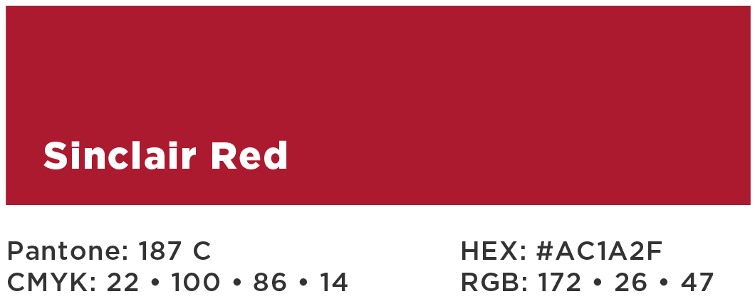
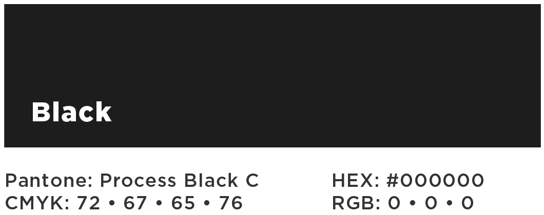
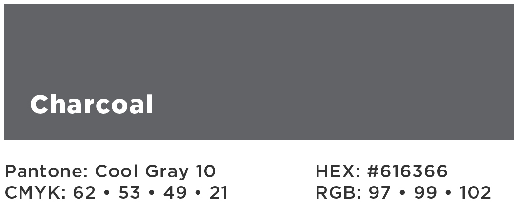
Sinclair’s primary colors are red Pantone 187 C (#AC1A2F), black Pantone Process Black C (#000000) and charcoal Pantone Cool Gray 10 (#616366).


Additional Web Colors
Additional web colors are only intended for use on the web as supporting colors for navigational sections within the website, where sub-page designs will include the section’s color. This will provide an intuitive design layer into the navigation, as well as enhance and brighten Sinclair’s primary colors to create a richer experience. At Marketings' discretion, Sinclair's additional web colors are also used to represent the different student types.


Colors originate from Sinclair’s Tartan. They are adjusted for accessibility compliance of proper color contrast levels for those with low vision or color blindness and for best use of color theory to maximize mood impact.
Logo Color Variations

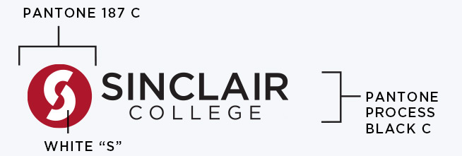
The Sinclair logo is used only in the following color schemes.
In cases of single-color printing, the logo can be printed in the specified color. It is best to use a single-color logo at high contrast for readability.


Accessibility Tip: Always check color contrast ratios to ensure text is legible against backgrounds, meeting WCAG 2.1 standards. Using Sinclair’s official colors as prescribed supports an accessible and professional brand experience.